Take this one, for example:

Source: https://images.app.goo.gl/6aHHKEx4HUTnWP3p8
Why do these mistakes happen again and again, and why don’t we learn from it. Let’s analyze the interface a bit.
When the user makes a spelling mistake (typing so quick because we are so used to it), he presses the ‘send’ almost subconsciously because of the behavioral level of processing in the brain. His fingers work faster than his conscious brain which sees the typo as soon as he presses send. Now looking at the screen he ‘perceives’ it is all fine because 1. There is no signifier saying the spelling was wrong and 2. He is interpreting that the text will be sent as typed in the text box and there is no signifier giving a clue that the corrected version will be sent (- yes the corrected version is sent without notice).
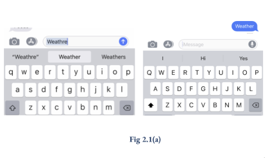
Let’s take a closer look, they have thought it out – There is a signifier present – Blue Highlight on word – that marks the wrong spelling. A second signifier is the white highlight on the autocorrected spelling on the bottom bar, probably saying “this is what I am sending it as”.
There are signifiers but they do not match the mental model.
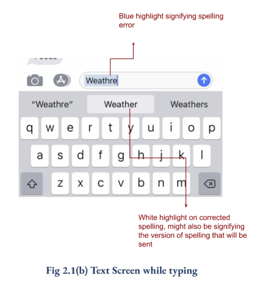
Here is what his Mental Model says and how the app and auto-corrects works against it.
-
The Mental Model says that there will be signifier like red lines/ something red signifier marking spelling errors
-
The Mental Model also says that the text will be sent as it is typed visible in the box, the white highlight is not a very strong signifier, something more apparent is needed to mark that.
The Autocorrect on Iphone’s text apps are not designed with the Mental Model of a layperson, the problem persists.
There could be multiple ways to solve the problem, starting with a highlight that’s red or pink but I believe the designers kept the blue and white theme highlight to keep the interface neat and to avoid interruptions, solutions anyone?