Websites as Pieces of Art?
Every now and then I come across a website that leaves me in awe! Beautiful animations, color combinations, graphics, it’s almost like a piece of art. Interactive art at that. I am mesmerized, my mind is already finding out what CSS went where, where JS was used, is this a CMS? how did they structure this? ya da ya da…
A few seconds in, I am out of my trance, still smitten mind you, I start figuring out what the website is about? A few clicks here and there, I get some information. I realize I cannot find the navigation… or anything else in fact, I am kind of lost…
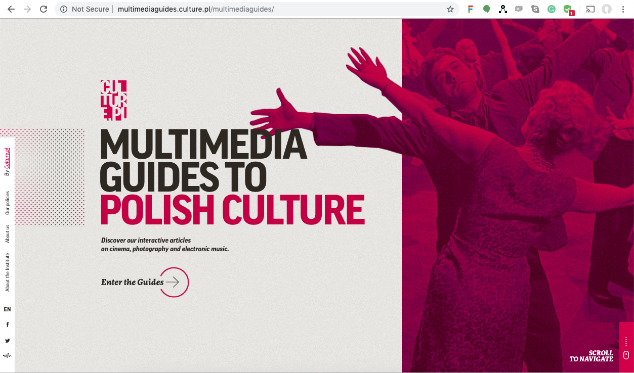
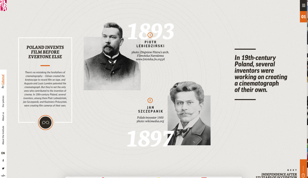
Take a look at this website for a few seconds: link
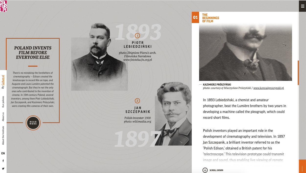
I did not write the title of the website to see if you can find out what it is about in 10 seconds, were you able to find the purpose? the navigation? anything? It is a Multimedia Guides for Polish Culture. It just says that on the first page, except a regular person won’t understand what a Multimedia Guide is (I don’t). I figured out in a few minutes it has articles on Polish culture. By the way, the ’01’ on top right opens the navigation on secondary pages… and oh look I finally noticed there is a small almost hamburger button on top of that for… ‘Chapters’? and now I see ‘scroll to navigate’ in the screenshot, I never noticed that before.
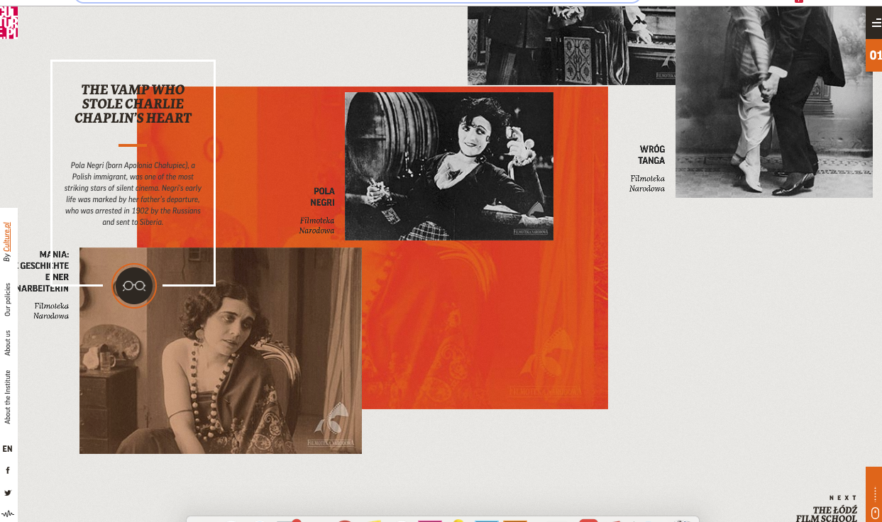
These interfaces, though wonderful, attractive, and visually engaging are a disaster for business and User Experience. If we use the idea of ‘Root Cause Analysis for Designing’ in Don Norman’s book (Design of Everyday things) we have to start with the whole purpose behind the website. The main purpose of most websites is business: get more clients to the salon, visitors to the museum, shoppers to the store, or driving sales online. With confusing interfaces like these, none of these objectives can be met. In the end, web users will be in awe of your brand but can’t figure out the address or the contact information.
It is important to keep the goal in mind when designing an interface. If the goal of the website is to show your skills and creativity, then for sure this is it. On the contrary, like most websites, if the goal is for people to read articles or find information like contacts, location, timings or events, then it is far better to go for nice clean website, with good navigation (that is also visible), and a footer with all your social media links and contact information, you can use animations as far as it doesn’t take away from User goals and UX.
In the case of reading articles, make it simple with minimal initial animation and more space to the actual text than the images and beautiful layout unlike our example of Multimedia Guides for Polish Culture, it’s beautiful but a bit terrifying for usability.
– Sana
Wow! The website you linked is definitely cool but I agree it is hard to figure out exactly what I am looking at. Not to mention the auto-play music—a big no-no in my opinion!
I agree, and I didn’t even know there was music on it!! That must be like icing on the cake, and not in a good (UX) sense.