Modern & Post Modern Typography
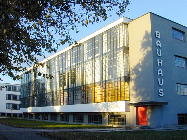
Modern Architecture with its plain straight lines, glass and concrete structures did not inspire me as a student of Architecture in the early 2000’s. The slogans – ‘Form Follows Function’ and ‘Less is More’ required Architects to design in a minimalistic fashion and stick to the essentials when designing. It was impersonal with very little room for expression.
On the contrary, I admired the ever-different, colorful, and sometimes absurd – Post Modern Architecture. It had a twist to the Modernist Catchphrase with a ‘Less is a Bore’. For me, Postmodern Design was out of the box. Architects had artistic freedom to express their creativity rather than to follow the footsteps of others before them.
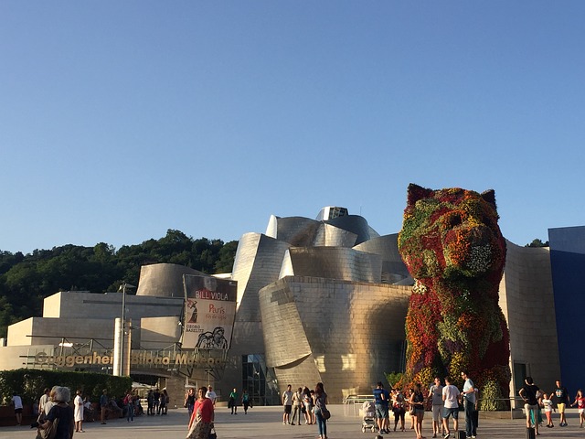
We still live in the Post-Modern era of Architecture with the tag – ‘Everything Goes’. People still design buildings with a set of rules like old times but they are not afraid to break those rules and make a statement. They designed with their own perception, inspiration and design style. The result is all styles of amazing buildings, from Frank Gehry’s Guggenheim Museum to the famous Sydney Opera House which was nothing like standards of the Modern or Historical Era. (Check out some Post Modern Designs here). The by-product of this movement were wild and crazy designs that are out-of-the-box, sure, but not in a good way.
As years went on, my design choices and admirations changed from more personal to something that inequally inspired the majority if not all: The clarity and unambiguousness of Modern Architecture.


Modernism & Post Modernism in Typography:
Watching the documentary Helvetica, was like listening to that story all over again from another context. I discovered that the Post Modern movement did not just happen in Architecture, but it translated into other fields of Design like Typography and Graphic Design. Helvetica, with its clean lines and fuss-free shapes, was the Modern era of Design in Typography. It was a long time coming, the movement that led us to Helvetica came as a reaction to the ambiguous typography of the time. Every action though has an equal and opposite reaction, so was the reaction to Modernism. The postmodernist were purely there to not only break the rules of Modern Design, but design itself! They improvised everything and put their mark on it. They used colors, handwritten fonts, a variety of sizes, compositions and everything in between. The results were an amazing portfolio of work by some as well as crazy weird designs by the others. Look at some Post Modern designs here & here.
My personal conclusion is this: At this point in time (2019), we have come to terms with the ‘Everything Goes’ Philosophy, people appreciate Historical, Modern and Post Modern work of art, architecture, and design equally. For the weird designs out there – I believe that when non-designers try to play with the freedom of expression we have now, the results are less than desirable. They need to keep it simple, following Modern design is a safe bet. For professionals, I think this is the time when everything lives in harmony with each other. People belong to different schools of thought but appreciate a good composition and design just the same. This is the time where designers can stick to clean modern lines and mix it up with colors, or create ambiguous designs and still keep it simple. As long as it is well designed and yields results it goes a long way.

I like the sound of everything living in harmony!
I do too! Imagine being born in the time when you had to comply with the norm in design and there was no acceptance whatsoever for new ideas.