IA | Research & Design Project – 3
Wireframes and User Testing
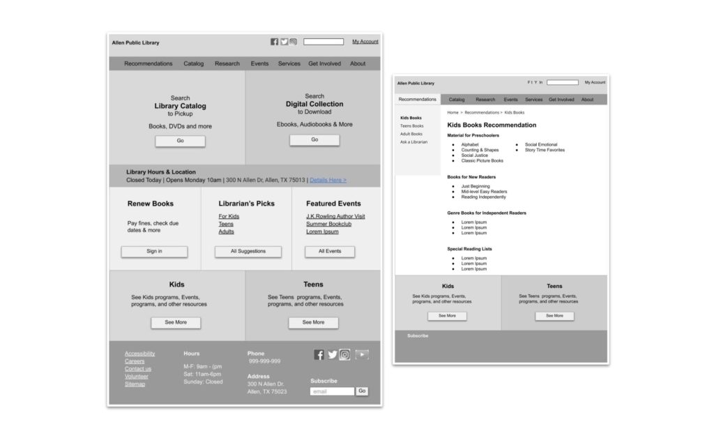
Initial Wireframes were created on the basis of the final sitemap. High Priority and Medium priority tasks were featured on the homepage.

User Testing Wireframes
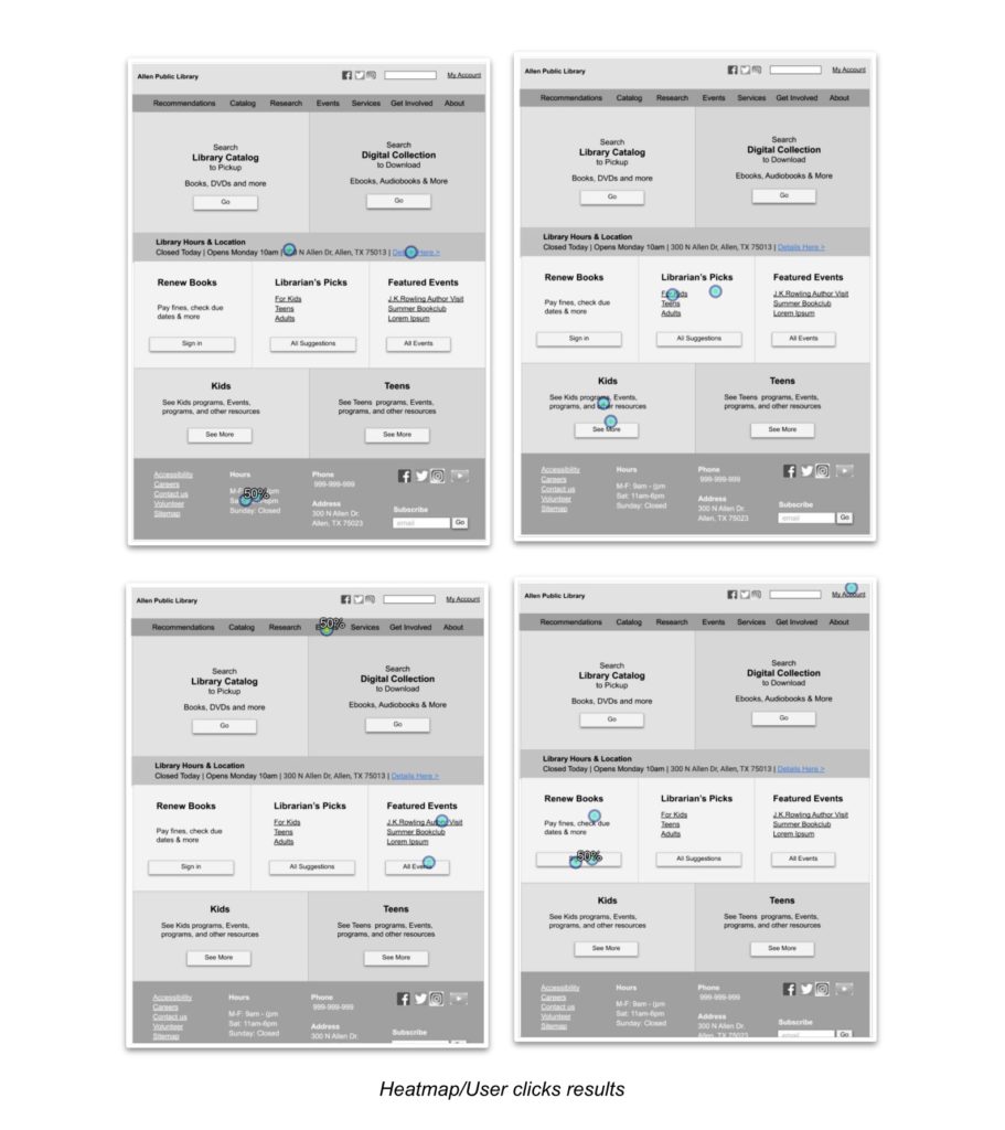
The Chalkmark software was used for this study, this software uses the ‘First-Click Testing’ approach, recording where users clicks first on the page to perform a given task. The study gave us insight into success or failure of our access points and labeling.
4 participants were recruited for this study, all participants have used library sites before. Detailed study results can be found here
Analysis and Recommendation
4 out of 4 participants were able to successfully complete all 5 tasks, here are the results and insights we got from my study:
- Participants clicked on the vicinity of the button or the whole block instead of the button itself
Recommendation: Make the whole block clickable or at least the paragraph text and the area around the button - The ‘Recommendation’ Label does not translate well for the participants.
Recommendation: Rename ‘Recommendations’ to “Reading list’ or ‘Librarian’s Pick’. - The ‘Catalog’ Label might not be translating well for the participants
Recommendation: We ran a couple of other tests from the subpage and observed users did click Catalog to download audiobooks. We decided to keep the label ‘Catalog’.

