Enhancing UX through Information Architecture: Library of Allen Website
Client’s Ask:
The organizational navigation scheme was not working for the library of Allen’s website. They wanted to reorganize the website for improved functionality, supporting user tasks and findability. They also requested to elevate the overall look of the website
Research Methodology:
I conducted a thorough overhaul to enhance functionality and facilitate user task completion and findability. Here is the methodology I applied:
- User Research Interviews
- Persona Development
- Site Structure & Site Map Creation
- Tree Testing the New Information Architecture
- Wireframes & First-Click Testing
- Final Mockups
Step 1 of 6: User Research Interviews:
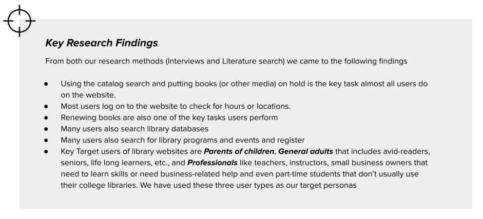
- To understand the user needs and pain points, I conducted in-depth interviews with librarians and patrons.
- Data Analysis was completed using Affinity Diagramming method.
- Literature search complemented the findings, providing valuable insights.
- Here are the Key Findings from the study:
Step 2 of 6: Persona Development:
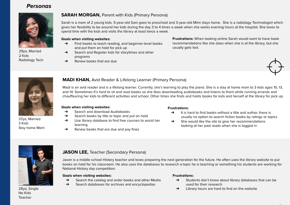
Based on the research, I crafted user personas, that came down to 2 primary and 1 secondary personas.
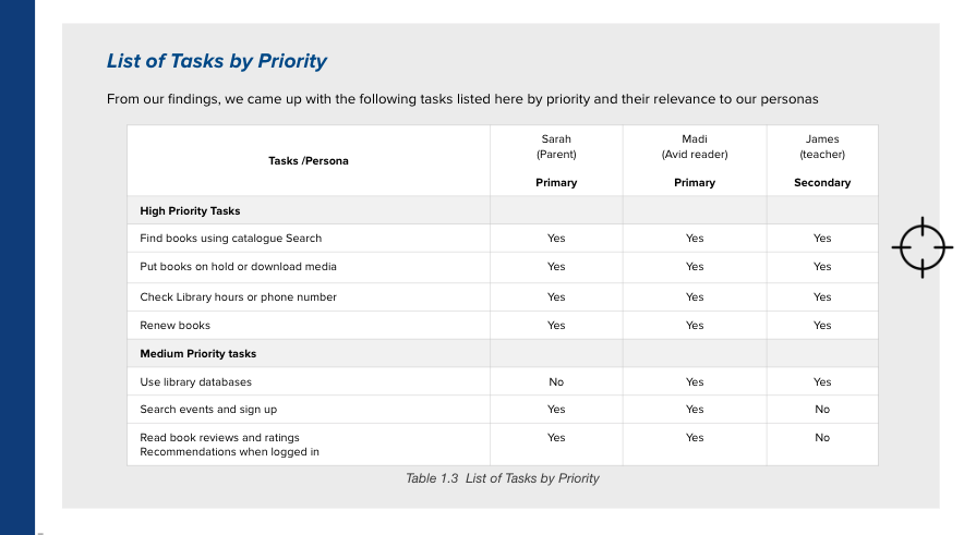
List of Tasks prioritized by Persona
Step 3 of 6: Site Structure & Site Map Creation:
Content Inventory & Analysis
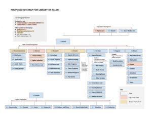
Conducting a detailed content inventory and analysis guided decisions on content inclusion, restructuring, and identifying gaps.
Proposed Organizational Scheme:
The proposed organizational scheme blends a topical and task-based approach for seamless global navigation.
Ambiguous scheme for global navigation
Step 4 of 6: Tree Testing the new Information Architecture:
Conclusions from the Tree Test:
- Majority key tasks proved to be successful, Participants understood the labels and categorization and found their way to perform the task with ease.
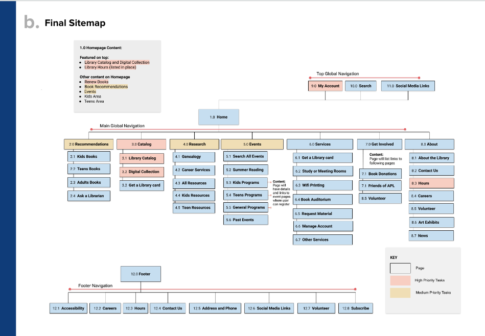
- Participants had difficulty finding ‘Study Rooms’. The structure was streamlined removing the third tier links and move it under services
- Participants faced difficulty in accessing audiobooks due to the label ‘Borrow’, prompting a rename to ‘Catalog’.
Updated Sitemap
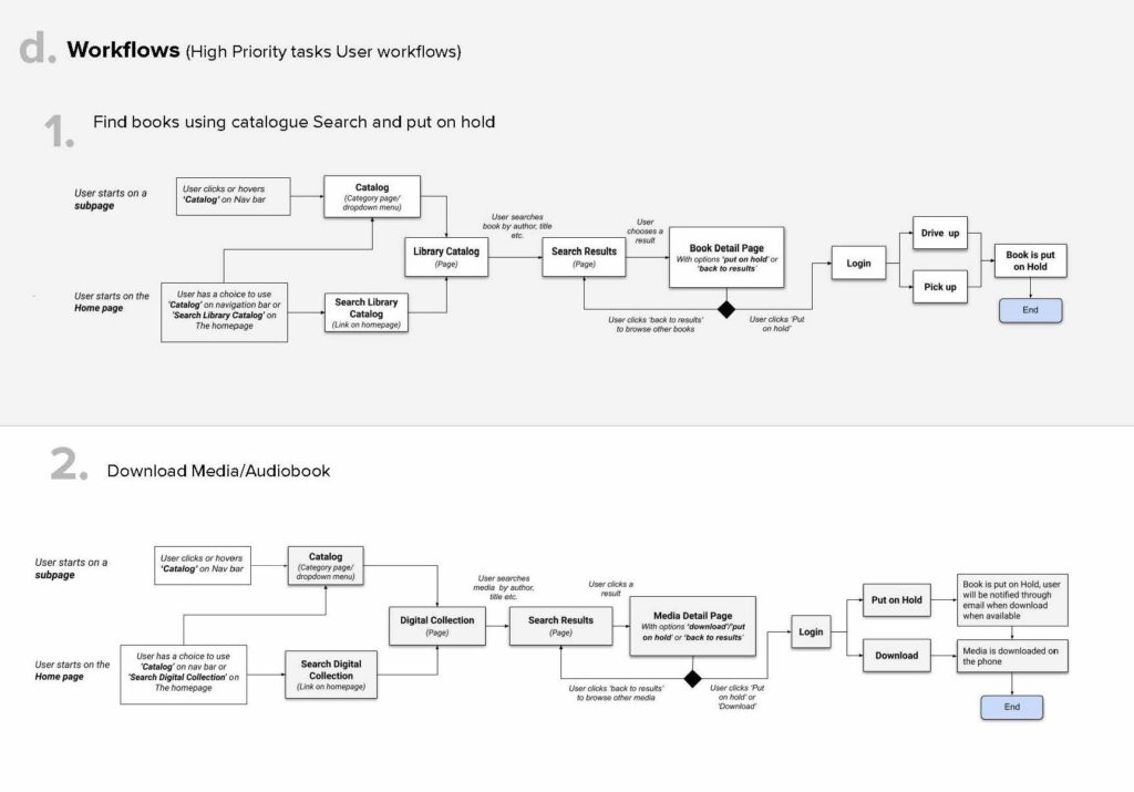
Workflows for tasks by Priority
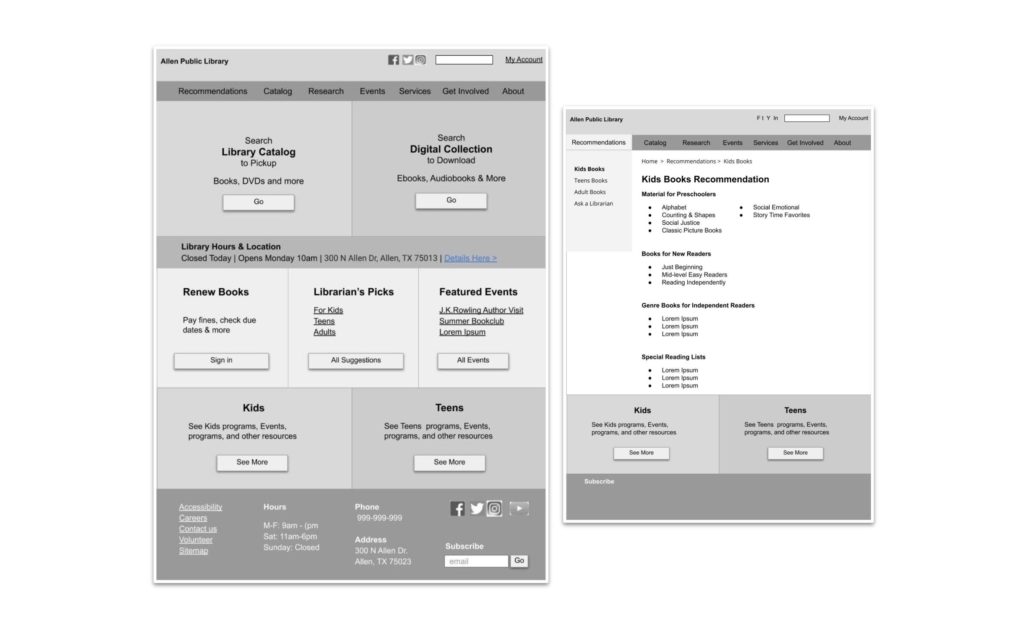
Step 5 of 6: Wireframes & First-Click Testing:
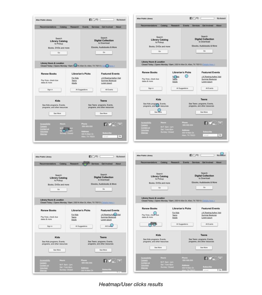
First Click Testing on Wireframes:
Key Findings & Recommendations from First Click Test:
- Insights from the first-click test revealed that participants often clicked around the button rather than directly on it.
Recommendation: Make the whole block clickable. - the label ‘Recommendation’ did not translate well for the participants.
Recommendation: Rebrand ‘Recommendations’ to “Reading list’ or ‘Librarian’s Pick’.
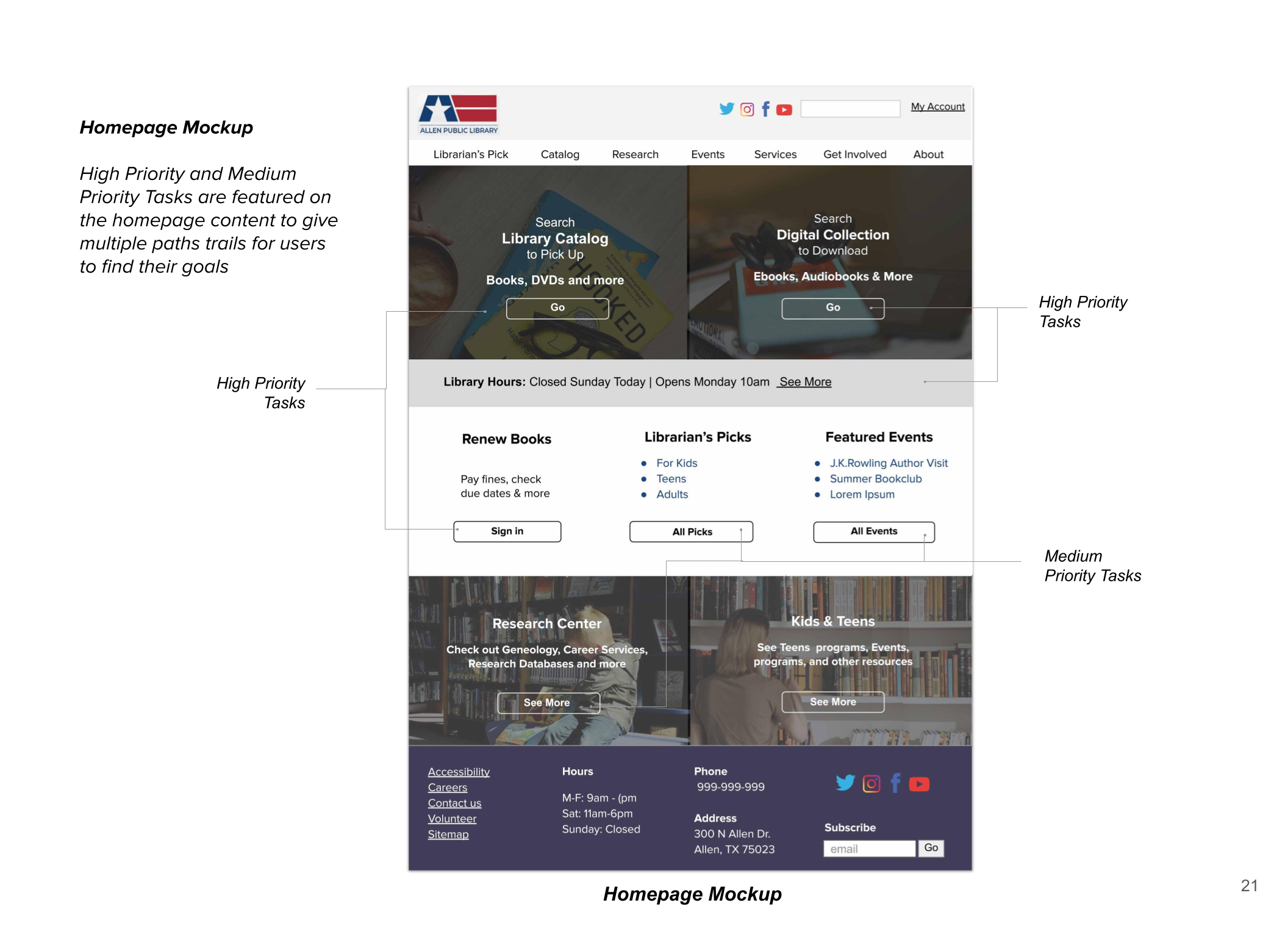
Step 6 of 6: Final Mockups
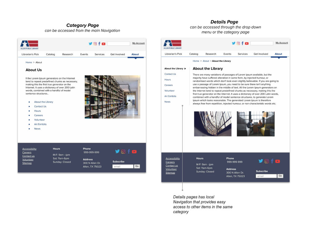
Subpage and Detail page
Thank you for reading through!
