
Optimizing Specialty Navigation for Cleveland Clinic’s Appointment Request Form
Background
At Cleveland Clinic, leadership aimed to reduce patient call volume and increase online appointment requests through a new online appointment request form. The form was scheduled to launch in two months, but it had not undergone formal usability testing. I joined as a Sr. UX Researcher and collaborated closely with product managers, designers, developers, and QA to identify and resolve critical usability issues before and after launch, improving patient experience and operational efficiency.
Research Objective
A month before launch, I led a usability study to identify key blockers affecting appointment requests, including silent task failure, confusion on the introductory page, and specialty selection difficulties. Follow-up research (card sorting, tree testing, and usability testing of a new tile-based specialty design) was conducted to refine and validate the specialty navigation.
My Role: Lead UX Researcher | Individual Project
Collaborating with cross-functional teams, leading UX studies, and providing actionable recommendations.
Process
I first conducted a pre-launch usability study that uncovered critical form submission and navigation issues. Quick fixes were implemented before launch to prevent lost appointments. Post-launch, I led card sorting and tree testing studies to understand patient mental models for specialties. Based on findings, a new tile-based specialty selection was designed and usability tested with diverse participants to validate improvements. Throughout, I ensured research insights directly informed design and development decisions, contributing to a 3x increase in appointment requests in the first month post-launch, and 8x in 6 months.
Table of Contents
Pre-Launch Usability Study – Key Findings
1. Pop-up distrupted form submission, causing silent task failure
In the final step of the 10–12 step form, clicking Finish opened a MyChart pop-up for self-pay patients to schedule a financial advisor call. 3 out of 5 participants completed the pop-up but never closed it to return and submit the main form.
Solution: Weeks before launch, with no time for flow redesign, I proposed a quick, low-effort fix: trigger form submission on the review screen’s Finish button before opening the MyChart pop-up, ensuring all data was captured whether users scheduled a callback or closed the window.
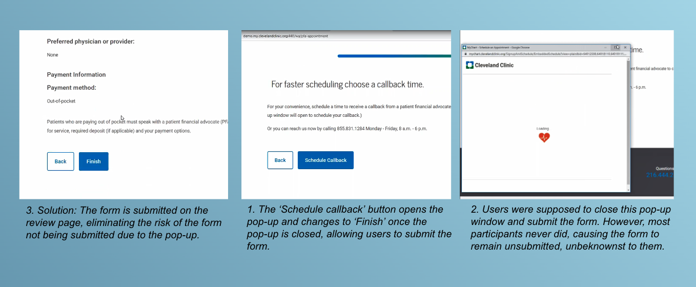
Impact: The intervention ensured an estimated 3,900 self-pay requests per month were successfully submitted, avoiding $1.17 million in revenue loss per month. By identifying and resolving the issue before launch, it prevented lost appointments, operational disruption, and patient frustration.
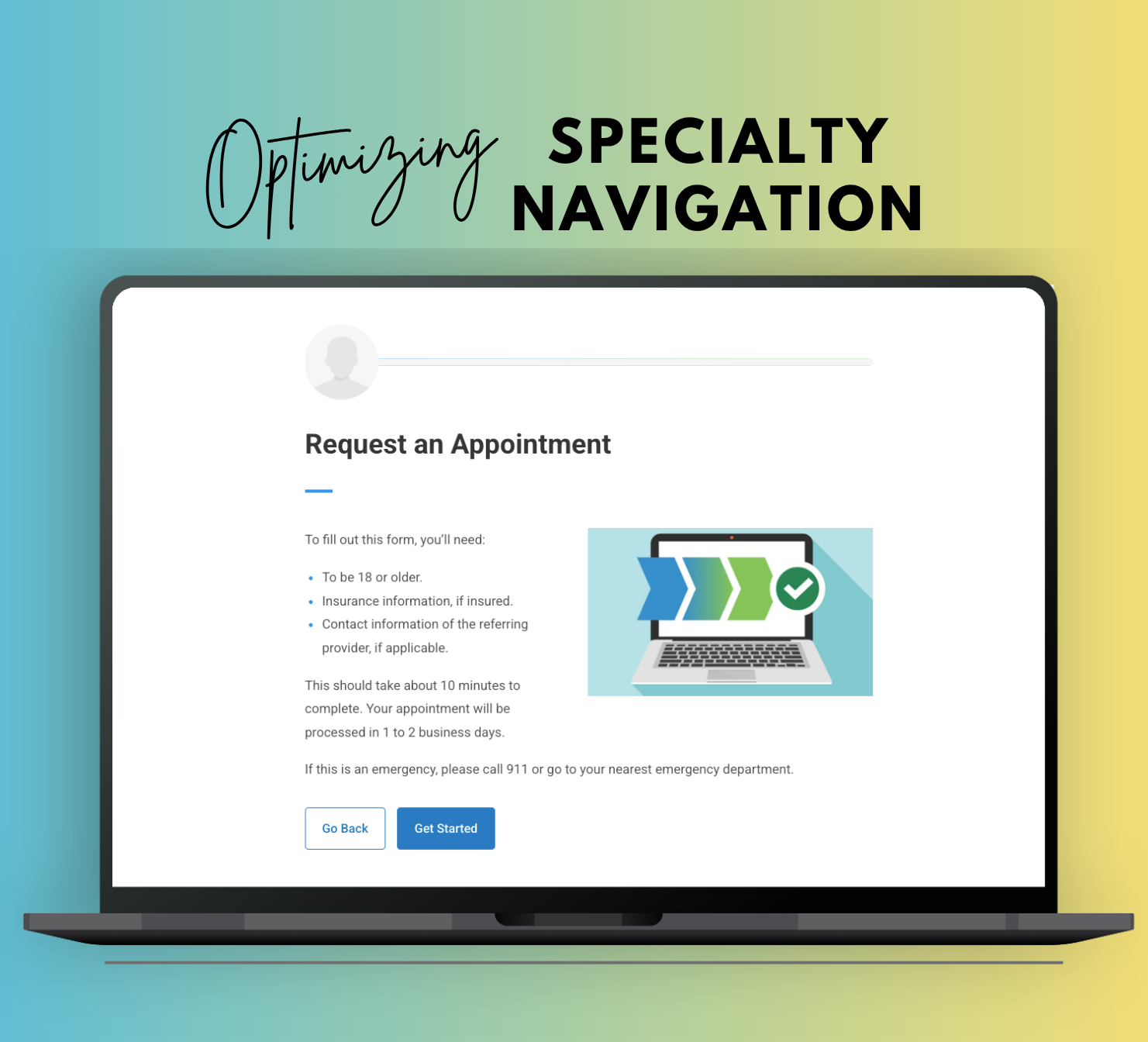
2. Unclear Intro Page and Hidden Start Button
Finding: Participants were confused about the start page’s purpose despite instructions, one asked, “Is this what I’m looking at? This ‘what to expect’?” They largely ignored the long text, with one saying, “This is a lot of reading. I wouldn’t read this.” The “Get Started” button was below the fold, so all participants didn’t reach it initially and needed help to continue.
Solution: With weeks to launch, we added a clear page title. Before the next release, we collaborated with a UX writer to shorten the text and moved the “Get Started” button above the fold for improved visibility.
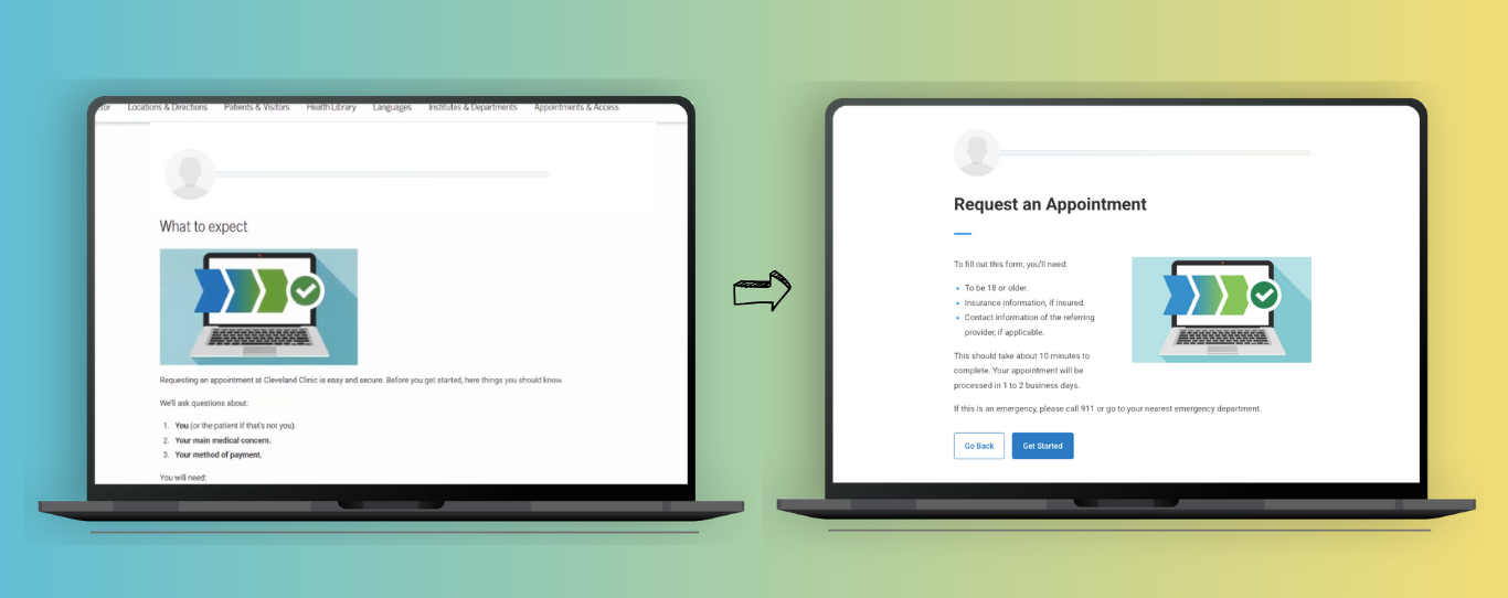
Impact: These changes reduced confusion and drop-offs, improved user orientation, and increased form starts and completions—boosting conversion rates and enhancing the user experience.
3. Specialty Selection Confusion
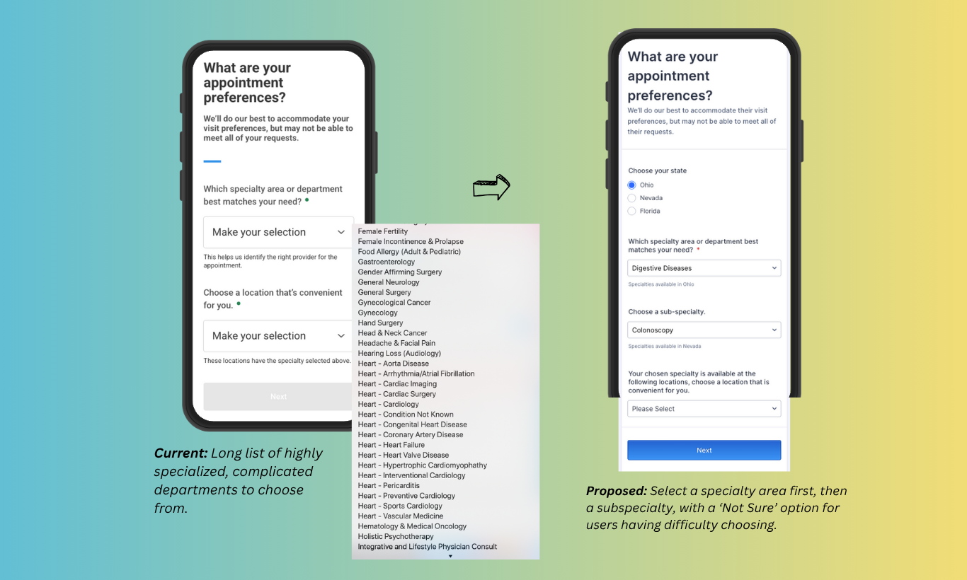
Finding: Users struggled to choose from a dropdown of 100+ ungrouped specialties, often confusing similar ones (e.g., Neurology vs. Dementia). Testing revealed 5 task failures due to wrong selections and 2 abandonments due to indecision.
Solution: With limited time before launch, we added a “Not Sure” option as the first specialty choice to help users continue through the form.
Impact: The “Not Sure” option reduced abandonment, increased completions, and routed undecided appointments to a dedicated team, reducing rerouting and administrative workload.
Long-Term Solution: Restructuring Specialty Selection
Expecting users to pick from 100+ specialties was unreasonable. As a long-term fix, I proposed a multi-step process: first select a main specialty, then a subspecialty or service. The ‘Not Sure’ option stays.
This simplifies choices, reduces cognitive load, and improves accuracy. Backend changes were needed and confirmed feasible by developers.
Next Challenge: Restructuring 100+ Subspecialties
How do we group 100+ subspecialties, from Reiki to Physical Therapy to Cancer care, into clear, relatable main Specialty categories users can easily navigate?
Follow-Up Research: Card Sorting Study for Specialties
My Role: Lead UX Researcher | Individual Project
Research Goals & Approach
To understand how patients expect specialties and subspecialties to be organized, I conducted two unmoderated card sorting studies with 25 participants each over three months. Participants grouped subspecialties into categories, placing each card in only one group to find the best fit, then named each specialty category. Analysis revealed common user grouping and labeling patterns.
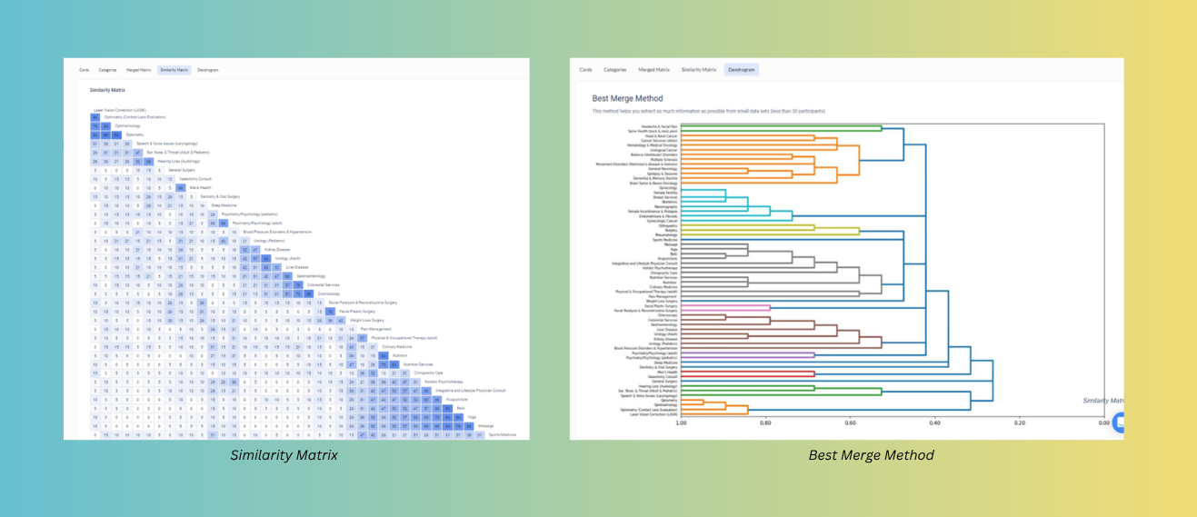
Key Findings
- When naming specialty categories, participants typically named well-known specialties like Neurology or Orthopaedics by their official specialty names.
- For lesser-known specialties like Nephrology or Hepatology, participants often used body parts or organ names such as Kidney or Liver.
- Participants tend to group all pediatric-related specialties (pediatric cardiology) in a pediatrics category instead of cardiology.
Key Recommendations:
- Use both specialty names and common terms where appropriate for main specialty categories (e.g., Cancer (Oncology), Neurology (Brain Health)) to improve clarity.
- Label lesser-known specialties with familiar names like Liver Disease and Kidney Disease for better user understanding.
- Include pediatric specialties (e.g., Pediatric Cardiology) in a dedicated Pediatric category, while also listing them in related specialty areas (e.g., Cardiology).
- Similarly, duplicate subspecialties that align with multiple specialties—for example, “Spine Health” appearing under both Neurology and Pain Management, reflecting participant grouping patterns.
- Note: The completed structure for specialties and subspecialties is not disclosed due to confidentiality.
Expected Impact:
Aligning specialty categories with patient expectations will reduce confusion and improve navigation, increasing completed appointments. It will also streamline scheduling workflows by minimizing reroutes and appointment delays, enhancing the overall scheduling experience for patients and staff.
Follow-up Research Study: Tree Testing on Specialties
My Role: Lead UX Researcher | Individual Project
Research Goals & Approach
To validate the specialty hierarchy and labeling from the card sorting study, a tree test was conducted with 30 participants focusing on hard-to-find subspecialties. This assessed clarity and ease of navigation.
Key Findings & Recommendations
Tree testing confirmed the overall structure but identified areas for labeling improvement. Cross-listing specialties improved findability. Category titles were refined, and some subspecialties were duplicated in other specialty categories.
Expected Impact:
By involving users at every stage of defining specialty areas, the project improved the organization and labeling of specialties, making it easier for patients to find and book appointments efficiently.
Follow-Up Research: Usability Study on New Specialty Cards Design / Benchmarking
My Role: Lead UX Researcher | Individual Project
The design team developed a new tile-based layout for the updated specialty structure, replacing the previous two-dropdown format with a two-step experience in which each specialty appeared as an individual tile. A moderated usability study was conducted to evaluate the usability and clarity of this new format.
Benchmarking: While the study did not cover the full scheduling flow, it served as partial benchmarking. Three identical tasks from the original study were repeated with the new two-step specialty structure, allowing direct comparison of key metrics with earlier results.
Key Findings
- Participants generally found the tile-based design more visually engaging and easier to scan than the previous dropdown format.
- Compared to the previous study, task failures dropped from three to zero, indicating clearer navigation and improved structure.
- Tasks involving well-known specialties were completed faster, with overall task time reduced by an average of 32 seconds.
- The two-step flow reduced initial overwhelm, especially for users unfamiliar with medical specialty terminology.
Key Recommendations:
- The tile format was generally well-received and easy to scan.
- Diversity in participants revealed different expectations for specialty naming, highlighting the need for both official and common terms.
- Some participants relied heavily on visual scanning, underscoring the importance of clear, concise labels.
Expected Impact:
The tile-based design is expected to speed up specialty selection, reduce errors, and improve patient and staff experience. Task failures dropped to zero, and completion times decreased by 32 seconds on average. The design is not live yet on the website.
Bonus: What I’d do if I had more time
One key finding from a user research study I conducted on healthcare goals was that users want easy access to specialties on hospital websites. Currently, Cleveland Clinic lists Institutes and Departments, which focus more on internal structures rather than patient-friendly categories like Specialties and Services.
Given more time and the opportunity to work on the main website and navigation, I would propose adding a dedicated Specialties and Services page that lists specialties and subspecialties following the structure we developed through various UX studies above, helping patients connect quickly and clearly to the right resources.