
Moderated Usability Study
As part of an independent evaluation, I conducted a moderated usability study to understand how first time users interact with Slack; a widely used communication platform. Let’s start with the key takeaways and then look at the methodology and detailed insights.
Disclaimer: This study was completed in 2021, some of the findings might already be resolved in the current app.
Key Takeaways
- Complicated sign-up process due to multiple password requirements. (watch video summary)
- Confusing navigation labels that do not follow naming conventions.
- Typing out email addresses gets tedious when inviting others.
- Users land on Slackbot (Slack’s built-in virtual assistant) and mistake it for the homepage.
- Too many channels confused new users and left them unsure where to start.
- Most participants were only able to complete two out of four tasks without assistance.
Let’s explore the findings and recommendations first; methodology, study goals and participant details will follow.
Detailed Findings and Recommendations
Finding 1 of 5: Complicated Signup Process: The sign-up process was tedious for participants. Users were required to create a new password for each workspace, which added unnecessary friction.
“The sign-in process didn’t look very intuitive… There were a lot of fields, it looked a little bit busy.”
— Participant 1
- Recommendation: Simplify the sign-up flow to allow a single login across workspaces. Provide an option to join new workspaces using existing credentials.
Finding 2 of 5 | Confusing Navigation Labels: Participants found many Slack labels unclear or non-standard. Terms like “Threads,” “Slackbot,” and “Workspaces” didn’t match user expectations or mental models.
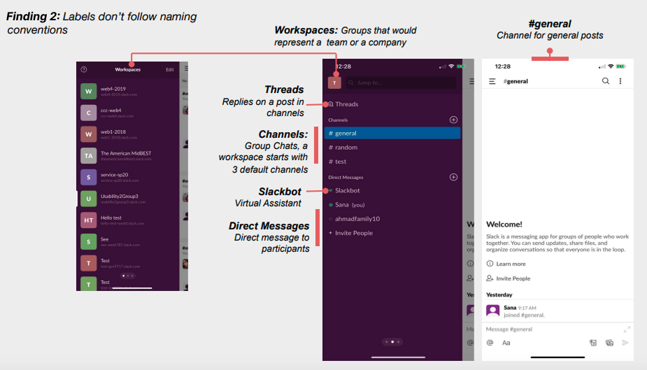
“I would change some of the names…like workspaces, I don’t know what that means.”
— Participant 2
- Recommendation: Replace non-conventional labels with more intuitive alternatives like “Home” or “Messages.” Consider clarifying or renaming Slackbot and Threads.
Finding 3 of 5: Entering Email Addresses is Tedious: Most participants tried typing the email instead of the ‘Get link’ option and found it difficult to manually enter or remember email addresses when inviting others. The alternative option to send a direct invite was hard to notice.
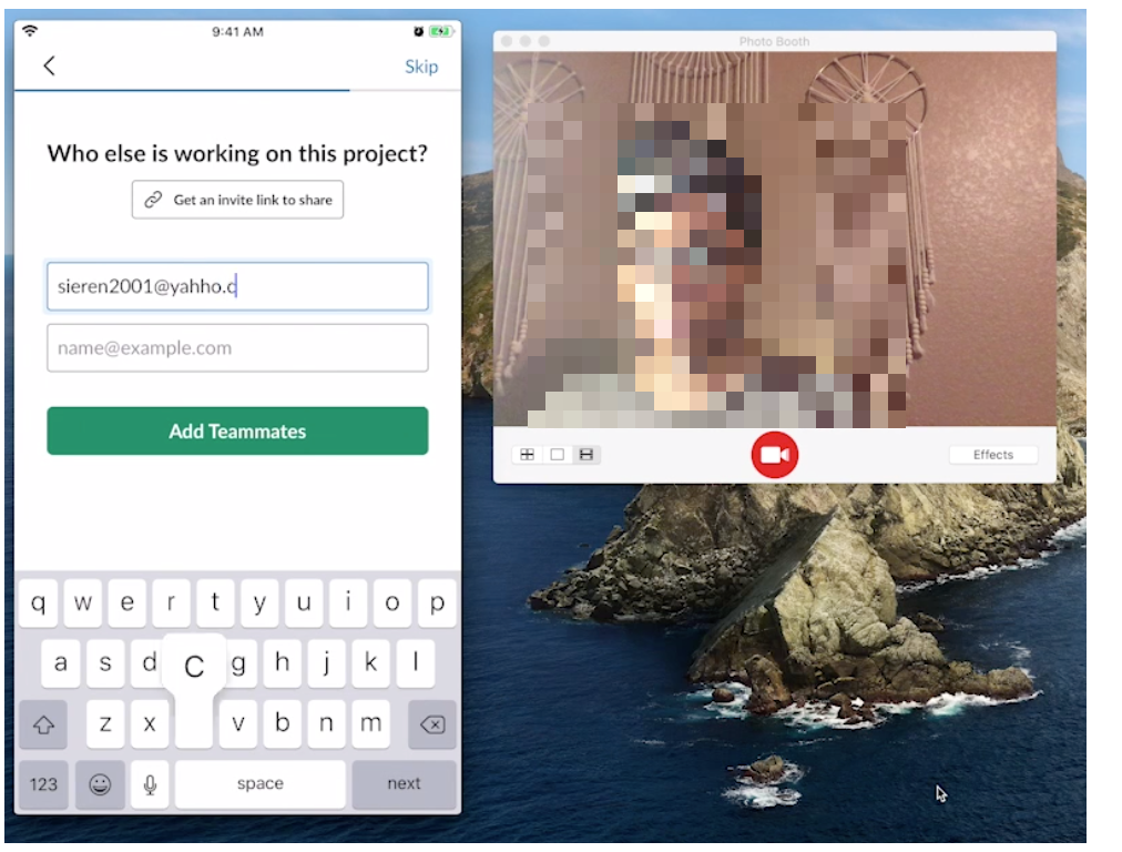
“It’s hard to remember emails—I had to go back and forth to copy and paste.”
— Participant 1
- Recommendation: Highlight the direct invite option as a primary option and rename the button to “Send Invite” for clarity and actionability.
Finding 4 of 5: Users Land on Slackbot and Mistake it for the Homepage: After accepting an invite, users landed in Slackbot—a virtual assistant—and assumed it was the main communication space. 3 out of 5 participants posted their introductions in Slackbot instead of the team channel.
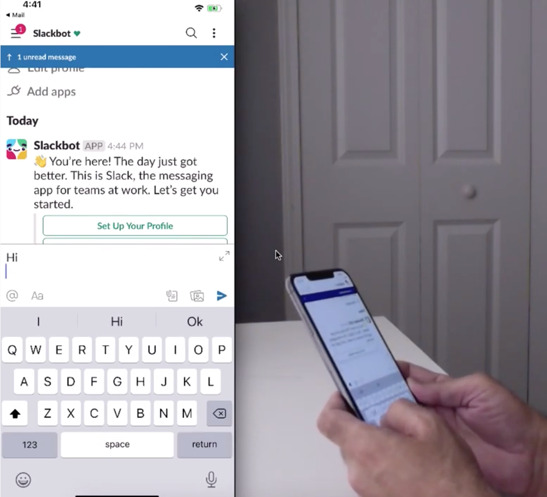
“I thought it would automatically take me to the channel…”
— Participant 2
- Recommendation: Direct new users to a default channel after joining a workspace, where they can see posts from others and participate collaboratively.
Finding 5 of 5: Too Many Channels Confused Users: Slack starts with multiple default channels, which overwhelmed new users. Participants were unsure where to begin and often hesitated to post.
“It was a little confusing trying to figure out…like where I was supposed to post.”
— Participant 1
- Recommendation: Start workspaces with only one default channel. Let users create additional channels when needed.
APPENDIX
Methodology
- A moderated usability study was conducted to evaluate the Slack mobile app. Sessions were a mix of in-person and virtual formats conducted via Zoom.
- Participants were assigned three tasks: onboarding and joining a workspace, creating a post, and sending an instant message.
- Screen recordings captured participants’ interactions with the app interface.
- Video recordings captured hand movements and facial expressions during task completion.
- Participants answered pre-task and post-task questions to provide additional insights.
- The desktop version of Slack was not included in the study.
Goals:
- Evaluate the usability of the Slack mobile app for first-time users.
- Identify pain points and usability issues in the onboarding and workspace joining process.
- Assess the ease of completing key tasks such as posting messages and sending instant messages.
- Observe user behavior and navigation patterns within the app.
- Gather quantitative data such as time on task, task success rates, and satisfaction ratings.
Participants:
| Participants | Age Range | Gender | Used Slack before? | Other Collaboration apps |
| P1 | 41-55 | Male | No | MS Teams |
| P2 | 22-40 | Male | No | MS Teams |
| P3 | 22-40 | Female | No | Google Docs |
| P4 | 41-55 | Female | No | MS Teams |
| P5 | 51-65 | Female | No | MS Teams |